In recent years, the Rays have slowly increased the presence of their lighter blue color and now it sounds like the Rays are ready to make “Carolina blue” their primary color.
During a recent round table discussion of the Rays’ marketing campaign, Robert Trigaux of the Tampa Bay Times summarized some comments of Brian Richeson, Rays vice president of sales and service:
“Watch for the Rays (sunshine) “burst” graphic that appears on player hats and shirts to gain an even higher profile. “It’s kind of our Nike swoosh,” says Brian Richeson, Rays vice president of sales and service. Also watch for more “Carolina blue” on Rays uniforms rather than the darker cobalt blue so commonly used by some other teams. And fans that purchase “flex pack” games (three, six or nine games, for example) receive their tickets on a Rays card, introduced in 2014, that this year will feature parking at the Trop at half price.”
The first part about the “burst” graphic is no surprise. The Rays are very conscious about branding and that element has always been a big focus of the team. And while I have long wondered why the Rays don’t have an alternate cap with the sunburst logo, they do have the Spring Training caps with a sunburst which can be worn during the season. So maybe we will start to see those more often during games that count, something they did not do in 2014.
The second part is the more interesting comment. This could simply mean that we will see the Rays wear the Carolina blue jerseys more often. They were worn just 12 times in 2014, compared to 55 times they wore the navy blue alternate.
But the comment actually sounds like they are going to change the uniforms to include more Carolina blue. The obvious change would be to move from a navy blue cap to a Carolina blue cap. But if they do that, they could also switch the lettering and numbers on the white and grey jerseys to the Carolina blue also. But will the lighter blue pop as much on the lighter colored jerseys?
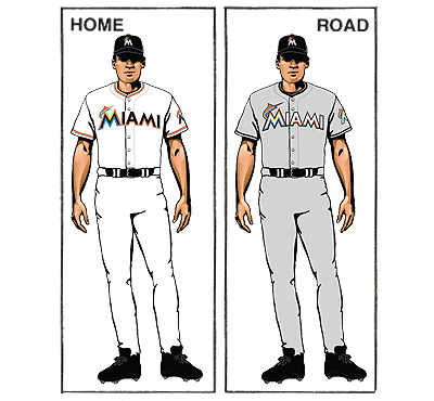
The only team that uses a light color on a white or grey jersey is the Marlins on their road greys (which coincidentally they never wore in 2014, but reportedly will this year), and in that case the letters are outlined in black.
At the same time, if the Rays kept the darker letters and numbers and just went with a light blue cap it would be unusual to have a cap that differed that significantly from the main color on the white or grey jersey.
So at this point it is a mystery. But changes appear to be coming, whatever they may be,
 (0)Dislikes
 (0)
(0)


13 Comments
Keep TB on the hat and put Tampa Bay on the road uniforms. Don't get cute.
If you follow baseball at the college, high school and youth levels, you will notice that the light blue is the "it" color and it is everywhere.
I for one am always a little trouble that we have an "animal" ray on the sleave and the sunshine "ray" elsewhere
Agreed - if the team's nickname is supposed to be the animal, then it should be more prominently integrated into the sunburst logo. If the team's nickname is supposed to represent the rays of a sun, then they should eliminate the animal altogether. If the latter is true, I get that having it on the sleeve is a nod to the past, but it's time to move on. Their nickname shouldn't be so ambiguous.
I've always thought making an alternate cap with the usual navy blue TB, with a carolina blue brim would look nice. They make a fashion hat that looks just like it and it's look very clean. Not too flashy, and the light blue adds a nice touch to make the hat pop, without being too flashy.
I will be happy if the sunburst grows. I've always thought more yellow should be incorporated into the unis. It is the "sunshine state" . . . .
Oh yeah, keep the actual stingray too. Much prefer that to the cheesy starburst thing.
THANK YOU!
The sunburst logo is terrible. Always has been, always will be. We aren't the Sunshine Rays. We play in a dome!
Oh, and it looks like bird droppings.
As long as the Carolina blue doesn't mean they want to move to Charlotte then I'm fine with it 😉
I guess I'm alone in strongly disliking the Baby blue unis.... YUCK.
Alternately, I love the Navy uniforms. They could leave the baby blue out altogether if it were up to me!
Not a big fan of the Carolina Blue at all...looks too babyish to me..Dark Blue is classy its simple. I agree with someone above put TAMPA BAY on the away jerseys. Represent the bay area on the road...and I do believe the Sun Ray is ugly...man oh man. Carolina Blue. No thank you.
Add yellow "piping" into the uniforms.
Forget "Tampa Bay" on the front - put that dude's screen name on the front!
Come on Rays, come on and get on board with Tampa Bay on the freaking road uniforms! It's been 8 exhausting, excruciating years since you LIED about it! Fix the error and get this right!!!! Stop lying and put Tampa Bay back on the road uniforms!!