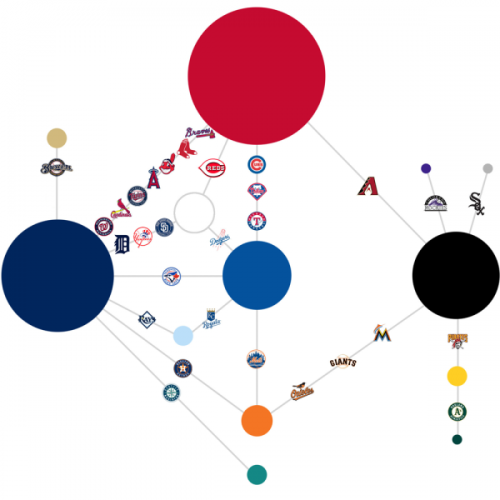
The graphic below has been around as it was first created at The Sports Design Blog back in 2011. But it is the first time I have seen it and it is an interesting look at how the Rays’ colors fit within the color schemes of Major League Baseball.
A few things stand out…
- The Rays are one of 20 teams that uses blue. They are one of three teams that uses two different shades of blue. 14 other teams use the Rays’ dark blue. However, no other team uses both of the blues that the Rays use.
- 12 teams use red, and one-third of all MLB teams (10 of 30) use both red and blue.
- Only the Rockies (purple), Mariners (teal), Brewers (gold), and White Sox (grey) have a color that is not shared with another team. However, it seems like a stretch to use grey for the White Sox and not white. But as you can see in the diagram, it would have been tough to connect the black and white circles (the design is supposed to be a baseball diamond).
- You can see similar diagrams for the NHL and the NFL at The Sports Design Blog, but it looks like they used silver as the Bucs second color instead of Pewter.
Likes (0)Dislikes
 (0)
(0)
 (0)Dislikes
 (0)
(0)


5 Comments
Blue is considered in graphic and digital design as the "safest" color in the palette. The least offensive, the one that a majority of Americans like.
Not a coincidence that most teams use it.
Maybe the Rays using two different kinds of blue means they want to be super safe?
Cannot stand that we wear navy blue like literally half of baseball. Wish we had colors that we could call our own.
MLB by far is the most visually boring sport from a uniform standpoint. No variety whatsoever. And we used to have something counter to that, but of course we dicked with it.
Rays ARE the only team to combine navy/baby blue. Technically that would count as our own colors. Better than neon green/neon blue/black/yellow/orange/garbage my 1998 innaugural season jersey is.
Sorry. I forgot PURPLE!
Meh. It's just trim. Our color is basically navy blue, just like the Yankees, Red Sox, Tigers, Indians, Twins, (pauses to take a breath), Mariners, Astros, Braves, Brewers, and Padres.
The green/black color scheme was solid. I would have tweaked the font n those uniforms but left the main structure.
If I was starting from scratch, I think something like Tulane's olive green/sky blue combo would be perfect and instantly recognizable. But hey, when you have a chance to go with the most generic colors and name in sports, you have to take it, right?